19/03/2018, 14:00
2017bestnine


"Our wee house" by Peter Gribben (aged 3)

Merry Christmas you wonderful old river and bridge #itsawonderfullife

Mornings are for coffee and contemplation

I didn't make it to Essen this year but I can still watch @gameofkittens live on Twitch #technologyrocks

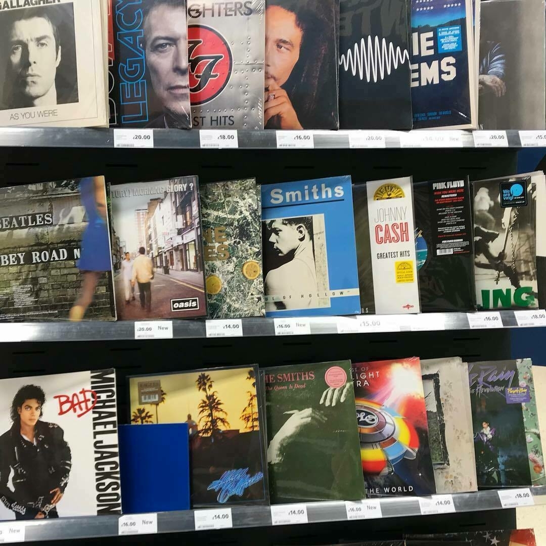
Vinyls in Tesco
Chilling with Numberblocks

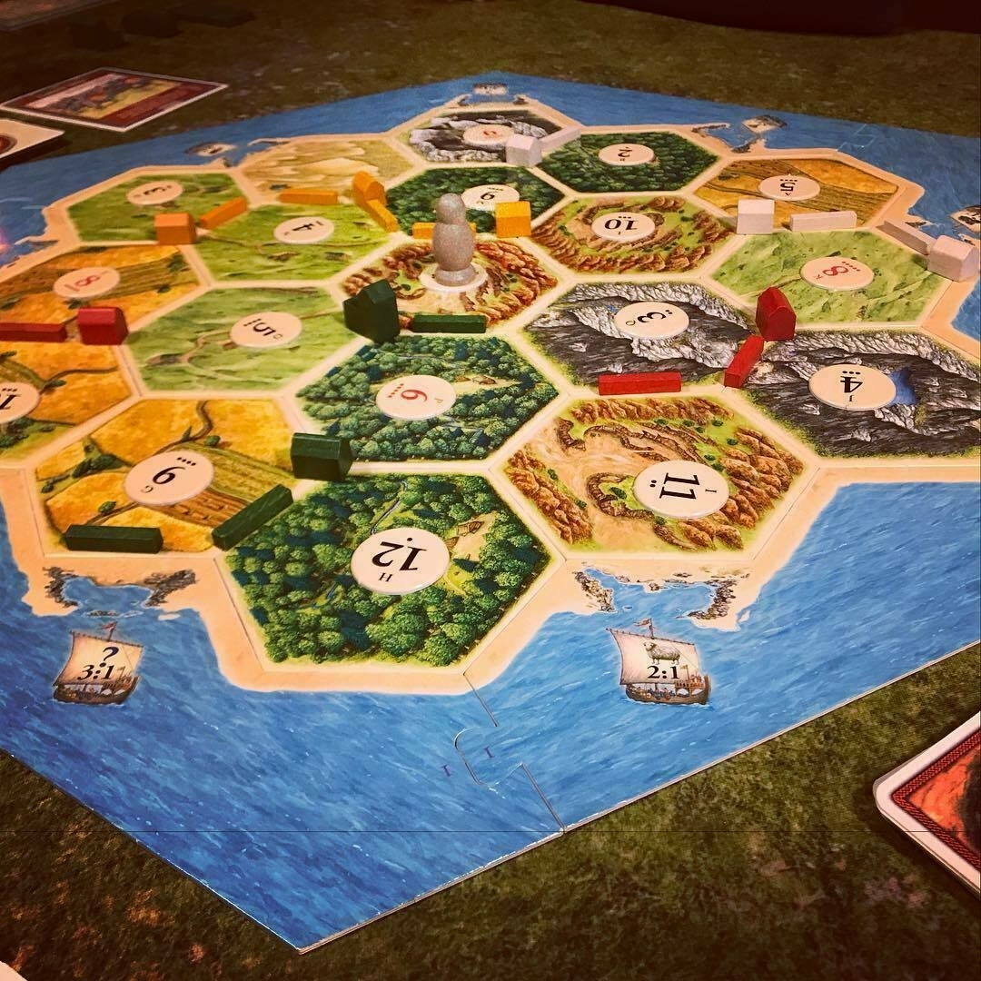
Pizza and Catan night ended with everyone still talking to one another and my victory! ? #lordofcatan
Instastory style travel video of our annual Dad/Daughter trip to #warhammerworld by #appleclips

A few thoughts on the new Apple TV
Alongside the release of their new tabletop game, Warhammer Age of Sigmar, Games Workshop have been promoting several new type of eBooks from their publishing imprint Black Library. For a company who already sell three distinct versions of their books, what does this mean, what is this “new” format and what does it mean for gamers?
First let’s look at the books we’ve seen to date, they fall into 3 categories, Print, Enhanced (iBook) and eBook (EPUB 3 and Kindle).

 The print edition is exactly what you expect, the same hardcover format that we’ve known for years, or is it? Around the end of 6th edition and release of 7th edition 40K there was a shift in the design of the BRB and the Codexes. Compare the text heavy Codexes of 2nd edition to the new Codex Space Marines and you’ll see what I mean. The newer books are full of high quality, full page images, spacious type and high-res photography with a consistent styling between digital and print versions.
It seems as though the print version is now being designed alongside the digital editions, rather than being tacked on as an afterthought and shows that Games Workshop is serious about digital content. Perhaps they are even taking a “digital first” approach, it’s certainly possible as the print books now look a lot like the iBooks edition, but is more likely that they have well defined templates for both.
A quick note on Digital First Design. Generally considered a good thing, there’s no denying that it can lead to a fresher, more modern looking book. That said, we’re starting to see publishing industry push-back, especially in education, as there is a definite feeling of sameness, even blandness to a lot of digital books that then migrates to print. eBooks are more or less packaged web pages, so some upcoming CSS standards should improve typography and layout options, allowing for much richer “print-like” designs in the future.
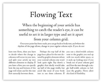
 Not all ebooks and certainly not all eReaders are created equal. In the “real world” we can classify books as hardback, softback, comic books, coffee table, reference and so on. Here in the Matrix they’re all just “eBooks” and all formats are expected to work everywhere; this leads to Lowest Common Denominator Design.
The latest James Patterson novel is ideal to read on your Kindle or Nook, but for anyone who’s ever tried to navigate Warhammer 40,000: The Rules on a Kindle Paperwhite mid game will find it to be a lesson in madness.
 The layout is perfectly nice but this type of reader isn’t really designed for this type of content, it’s designed for novels. So instead we chop up our beautifully designed to make it linear. It’s like printing out the content of the rulebook on copy paper. I’m sure some people like it this way or have low expectations for the technology, maybe they just want an easy way to read the fluff, but for gaming it’s a horrible experience all-round. Why? Because any digital book creates an inherently poorer User Experience that the physical equivalent. We “know” how to use a book and use it quickly, in a non-linear fashion, as we jump from reference to reference. But this isn’t how a typical eReader works, as it’s primarily designed for novels, anything beyond linear navigation is a feature that’s been bolted-on.
This is a huge problem in Education as textbooks are also used in non-linear ways. eBooks that were initially seen as the way of the future, are now considered to cause more problems than the paper books they aimed to replace. This left room for companies like Apple and Inkling to come up with alternatives.
The most popular form of alternative eBook is the iBook working hand-in-hand with the iBooks application on Mac and iOS. The iBook format is a proprietary extension of EPUB 3 introducing some functionality unique to Apple WebKit and addressing the issues above by allowing richer designs and providing a more appropriate reading experience.

As with Digital First Design this was at first considered a good thing.
Introduced by Apple at an education-focused event in 2012 the iBook was designed to solve the problem of creating digital textbooks. It allows anyone to create beautiful content specifically for Apple devices by using a WYSWIG editor and embedding interactive widgets like quizzes and galleries and an interactive glossary. The big improvement over standard EPUB 3 was the custom reader that Apple included in the iBooks Application (yes the format and reader are called the same thing. Yes there was also a laptop by the same name too) which provided a more natural method of navigation that your standard eReader. Using gestures you can swipe between Chapters, Sections and Pages and pan and zoom in and out to jump around in content.
Games Workshop started publishing books in this format back in 2012 and it finally seemed that a perfect format had been discovered for digital gaming books. If nothing else it certainly felt premium, further cemented by the release of Codex Space Marines which included enhanced features like embedded audio and the Force Requisition army builder.
It was around this point that I switched from print to digital, but as good as the iBooks format is, it does have issues. First off it’s iOS only and until very recently was iPad and Mac only. Secondly it’s slow. So slow. Apple added animated book opening effects to the iBooks software meaning that jumping from one section of a book to another (without a hyperlink) can take up to 10 seconds; in the heat of a game, that is way too long.
[caption id="attachment_10367" align="aligncenter" width="990"] This is a real-time animated gif of an iBook opening on a 2014 MacBook Pro.[/caption]
There are problems for publishers too, the books can only be built using Apple’s proprietary iBooks Author tool, effectively introducing an additional development track to the publishing workflow and only sold through iBooks, for which Apple take a 30% royalty. This is why publishers like Amazon and Comixology have removed all buying functionality from their apps, you can buy books from their online store and then download it to your device afterwards. It’s not a great experience for users but I can see why they do it, 30% is a huge junk wether you’re an indy publisher or a multinational.
I believe it’s been the dual pressures of providing high quality ebooks for non iOS users and a way to reduce the Apple tax on sales that has likely driven the creation of the new format released alongside Age of Sigmar.


 The ebook formats, EPUB 3 and Mobi, get a bad wrap. If you’ve seen the digital version of White Dwarf magazine you’ll know why. This is the same format that publishers use for novels, which obviously works well there, but makes it impossible to create more than the simplest of layouts. Known as “reflowable ebooks” this content will “flow” from screen to screen allowing you to change the font to suit and making it readable on any size of device.
Reflowable EPUBs can be created easily in many word processing packages and desktop publishing tools like Pages and InDesign or generated from a folder of text files. Content is king which is why the focus is put on type in this format, but compared to the the print or enhanced edition it looks like something your Nan could do in Microsoft Word.
What it does have going for it is that it is quick to produce and can run on pretty much every device. If you’ve bought the DRM free ebooks from Black Library, you’ll get a Kindle edition too (most publishers generate their Kindle books from the EPUB 3, which is why I didn’t include it on the list of formats.) Publishing through Black Library also allows Games Workshop to save the 30% that Apple takes on fees. Some may ask why GW don’t charge 30% more for books sold through iBooks and I’m sure they would if they can but Apple’s T&Cs stop you from charging a higher price for the same product on their store. On of the disadvantages of the Black Library is that for less technical users it can be pain to download and transfer ebooks; the Kindle is so successful due to the tight integration of eReader and store.
Two weeks ago my article would have stopped with the eBook edition, however Warhammer Age of Sigmar brought along a new flavour of eBook; no longer would Android or mobile users have to suffer the poorly laid eBooks we’ve seen in the past.
The recent iOS 8.4 update means the iBooks editions work on iPhone, so there’s no reason for iOS users to buy multiple formats.
The first of the new books was the Age of Sigmar paining guide, you can and should grab a sample of this on the Black Library site and in iBooks, it looks lovely. Or should I say they look lovely because the tablet and mobile versions have appropriately different designs and using an app like Calibre or Kindle Previewer you can freely and legally convert them to work on your Kindle too.


Like the standard eBooks, these are also EPUB 3 but used the fixed-layout flag in their config, this let’s publishers set a page size in pixels and layout the content exactly as they want it to show. Beautiful looking eBooks and on mobile too, have we just found the holy grail?
No actually. The fixed layout format has fallen slightly out of favour with publishers for a number of reasons, the biggest of these is that eReaders treat this type of content like a PDF in a few ways.
As each page in a fixed layout eBook is a single HTML (XHTML actually) page, iBooks uses the webkit rendering engine to process each page and generate a thumbnail, letting you scrub through pages quickly. However iBooks doesn't really cope with scale, possibly because people didn’t consider the 250+ page behemoths that we see in gaming and in education. Image trying to open 250 graphics heavy web pages at the same time, that’s what opening a large fixed layout book is like. Thankfully once it’s finished processing the book works great but on older devices like the iPad 2 or original iPad Mini you might find that iBooks crashes each time you try as it comes up against the memory limit on the device.
There’s nothing wrong with fixed layout EPUB 3 per se, it’s just that the eReaders let us down again; the portable reading experience is very different from the printed and should treated as such in both the design of the books and the eReaders used to consume them. So what is this format good for? In my line of work we use it a lot of kids’ story books and direct conversions of legacy books when stakeholders require a 1:1 match between print and digital; it’s generally considered as something of a step-backward in this case.
Unlike the iBooks (enhanced) editions the new fixed layout EPUB’s don’t require a separate development track, they’ve been generated from InDesign automatically, you can see this in the metadata section of the image below. For template driven content like this, once you’ve got a your first project set up, there is little to no additional work to generate fixed layout content for new books. Beyond clicking the export button that is.
So think about this, Games Workshop now makes a book once and can now export automatically to print, mobile, tablet and probably even ebook editions but instead of users buying a book and getting access to whatever format is necessary, users are encouraged to buy the same book multiple times generating almost pure profit for
I’ve said before that I have no problem paying the same for a digital book as the print edition, but this only applies to “prestige” formats like iBook edition, or Comics on Comixology, where care has been taken in the design and implementation to provide a better experience, e.g.. the special features added to the latest Codexes. Like many of you I’ll even go as far as to buy the print and digital editions of some books and the Horus Heresy series from Forge World is the type of book you’d only ever want in physical form but I have to draw a line at paying twice for what is the same thing.
There is no technical reason that the mobile, tablet and ebook editions shouldn’t all count as the same purchase, there’s even an argument that they should be available as a download with every print book or perhaps even charge a small premium like Marvel do with comics. I can’t help but think the iOS 8.4 update came at a bad time for GW, you’d think that with the number of iPhones in the market they wouldn't miss out on telling people that their books now work on iPhone too. Unless of course they want mobile users to buy another copy. (Of course they do.)
For my money I’ll continue to buy the iBook (enhanced) editions, the app may be slow, but it’s improving and as eReader designed for education its support for annotations and glossaries is second to none. The fact that I can now get these books on my iPhone only helps seal the deal. If I ever move to Android, yes that means I’d loose access to my books, but as it stands now I’d need to pay twice to have the appropriate book on both my Android tablet and mobile.
As someone who makes eBooks for a living, this might sound like I’m shooting myself in the foot, but be careful when buying eBooks, not only are you subject to lock-in in various book stores, but the terms and conditions from some publishers may mean that you never own the content and trying to convert from one format to another may mean you are actually in breach of their terms.
Always look for DRM free options where possible never be afraid to push back on publishers to improve the quality of their ebooks. You wouldn't stand for a brand new printed Codex if the cover was hanging off and the ink smudged on a bunch of pages, digital products should be no different.
Apparently 2013 is the year of the smart watch. Back in April one in particular caught my eye Pebble, by the aptly named Pebble Technologies took Kickstarter by storm raising $10 million (!!), well over their initial goal of $100K.
The Pebble uses Bluetooth 2.1+ EDR and 4.0 to pair with your phone an receive notifications, paired with an e-ink display the drain on both watch and phone is very low, unlike last year's Sony Xperia Smartwatch.
Out of the box (and on iOS especially) the Pebble doesn't do much more than show the time and weather, but on Android (and iOS 7) it can be set up to receive custom notifications, receive navigation directions from Google maps, control music and more.
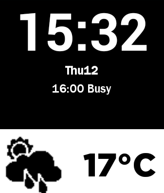
Honestly, it takes more work than most people would be bothered with, but I don't mind. I even took to creating my own watch face, combining the popular split-screen look with Calendar events. That might not be for everyone, but being able to look at my watch and see when and where my next meeting is, is a small win in my book.
For anyone else wanting to download the "Fancee Watch" face, you can grab it here http://archive.andrewgribben.com/oldblog/oldblog/fTMz and install it on Android using Canvas for Pebble.
Tablet form factor is an interesting thing; an iPad user since day one, I sold my iPad 2 after using the Nexus 7 for a week last year, but once the iPad Mini was released I jumped at the chance to own an iOS device in the 7" form factor. I am a Mac user, my primary phone is an iPhone, and regardless of how good the Nexus 7 is , the iPad fitted with my workflow, seamlessly. Setting the availability of certain apps aside (OmniFocus, OmniGraffle are both Mac apps that are available on iPad too) I'm not saying I can't use anything else, but at the moment, I don't want to, but that doesn't mean I won't try.
Through my day-job at Purple Guerrilla I've had the opportunity lately to test on all of the major 10" tablets. Despite going in with some pre-formed opionions about what I would and wouldn't like, I found the results quite surprising.
 First up, the "New" iPad, not the newer iPad, commonly referred to as the iPad 4. The differences are minor enough that for the purposes of this test, I'll consider them as one and the same.
The 10" iPad is a beast. I remember when the first iPad was released, it was like something from sci-fi, the iPad 2 form factor slimmed this down further, but compared to an iPad Mini, it's still huge. If you don't have an iPad Mini you have to understand just how slim a device it is. I was watching actual, near future, sci-fi a few weeks back and an iPad Mini used as a prop, looked so futuristic that I found it jarring.
There's something about the iPad's "premium" build quality and weight (slightly heavier than iPad 2) that make it feel very fragile; like handling your Granny's best china. Nexus devices get a bad rap for feeling cheap, but I have no qualms throwing one down on a coffee table; if I tried that with an iPad it would probably slide right off.
I really wanted this to be good, I genuinely mean that. I'm so divorced from the Windows way of doing things (since I installed that first free Red Hat CD from PCW Magazine) that I actually like Windows 8 and its Modern UI. The problem is that despite all the marketing and posturing, the Surface Pro is not a tablet. The Surface RT is a pretty lack-lustre device, but at lease it is a tablet, the Pro, despite the name is a completley different device. The closest comparison that I can make is that this is Microsoft's MacBook Air, it's a fully featured, Intel based, ultra portable notebook.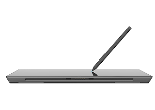
The problem's started when I was first handed the device. The Surface Pro is so heavy that you wonder what they've filled the device with. (This article is not about facts and figures, but about experiences and sensations; the things that actually matter when using these devices.) I know from The Verge's excellent review that the Pro is half a pound heavier, that makes this 10" "screen" it heavier than my 15" Macbook Pro.
Too heavy to use as a tablet and with an active battery life of no more than 4 hours, it seems that the Surface Pro is designed to be used at a desk. The inclusion of a Display Port for video out only reinforces this, as does the inability to charge via USB (like every other tablet), both Surface models require a reasonably large power brick. Whilst chained to my desk via power cord I noticed another problem, the Surface Pro comes with a stylus which clips limply into the side of the device, using the same magentic port that is used for the power adapter. So, that's going to get lost soon.
As metioned previously the Modern UI really appeals to me, so nothing is more frustrating that launching an app and being kicked straight into "Classic" or Desktop mode cough Office cough. I wish there was a more clear division, even a switch to disable the traditional Desktop and the apps that require it, however it seems most long-time users have more of an issue with Modern UI and want to kill it and reclaim their Start button.
Microsfoft like to compare their devices against those from Apple, recent ads have shown off the Surface's true HD (1080p) display and 64GB storage as standard, so it was a little surprising to find that roughly 40GB of that storage are taken up by Windows 8 itself. 40GB, just think about that for a moment. Imagine buying a 16GB iPad to find you have only 6GB of usable space, people are already outraged by the 1GB or so that they currently loose to iOS,
The Surface Pro could be a successful device, if I was working in a Windows environment, I'd certainly take it over a Lenovo Thinkpad, but as a tablet it would be easy to carry around one made of stone. It's also prohibitively expense, £719 without the essential keyboard/cover.
As some people will think that there was no chance I'd find any redeeming qualities in the Surface, I made this list of things that I do like.
I know it's been out a while, but the Nexus 10 (or any 10" Android) was never really on my radar. Thinner and lighter than the iPad and with the a 300dpi display, the Nexus 10, despite being made by Samsung (I generally find Samsung devices to be plasticky) is easily the best Android tablet I've used to date.
Android Jellybean 4.2.2 is not all that different from I last remember it, it's an incremental release, but one that makes the OS feel a little more coherent. For example calendar events from my Exchange account show in Google Now, previously Exchange email and calendars were left out in the cold; I guess Google thought no one in business would use a Google device. The "holo" interface, introduced in 4.0, brings coherency to what was a very fragmented UI (similar to what iOS 7 will hopefully do for Apple), Android looks futuristic, but is still very useable; not an easy feat to manage.
The device itself is strange, while the iPad is very uniform, the Surface solid (like the 2001 Monolith) the Nexus 10 is a bit "wobbly". With rounded corners and a asymmetric thickness, the Nexus 10 looks soft and friendly. It's also remarkably easy to hold in one hand, like a book. Something which I find painful with a large iPad and impossible with a Surface Pro. Sideloading of content to Google Books, extended Google Drive functionality, better Exchange support and a beautiful 300DPI display have made the Nexus 10 a real joy to use and I've found myself reaching for it over any other device
The one thing (literally the one thing) that lets the Nexus down is the fragmented Android development environment. When Apple released it's retina devices, with much fanfare, it provided the tools and incentive to developers to make their apps retina ready. Whilst almost all (citation needed) new iOS apps are built with retina support and pixel doubled graphics, most apps on Android that operate without the "Holo" UI have yet to be updated. The worst offender, Comixology, who already have HD comics on iPad but on the Nexus with an even higher dpi count, we're still looking at the low-res version. Digital comics may not interest you at all, but the principle is this, that the world leader in this vein of digital media, 5 months after launch, has not updated their app to support the Nexus 10's screen. My suspicion (based on limited Android development) is that the problem is not with Comixology, but with the Android SDK and the difficulty inherent with developing apps at multiple screen densities, for countless variations of device.
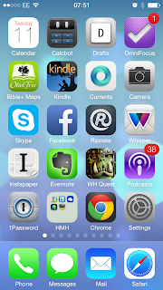 The best bit of yesterday's WWDC 2013 keynote had to be the change of tone within the address itself. This was a side of Apple that we rarely see; aware of its criticism and the ecosystem in which it exists. I don't see Steve Jobs doing that, but I don't necessarily think that is a bad thing either.
I've had around 24 hours to review and play with iOS 7, although my initial reaction was akin to a religious experience, the lustre quickly wore off when testing on a phone filled with third party apps. Much like the Microsoft Surface ads, the iOS 7 video had lots of shots of Apple's own apps (and Jony Ive in a white room), but back in the real world, what were once beautifully designed third party apps, now look heavy and out of place; an artifical barrier now wedged between the old and new design paradigms.
I love the new design language, unlike The Verge I don't mind the icons and I can accept that this is a beta, but I have to wonder how this will affect app development.These days the best Android apps use the "holo" design language, the same with Modern UI on Windows 8. iOS, on the other had, has a history of strong third party UIs, so it will be interesting to see how developers take to, or even adapt the new interface.
Parting thought: OS X Mavericks - Calendar and Maps seem to conform to the new design guidelines, should we expect a complete overhaul by the time it is released?
I've watched the coffee pod wars with a kind of bemused detachment. I don't need another way to brew coffee and the Nespresso and Senso brewed coffee I tasted was pretty bad.
The last thing anyone needs is an expensive way to make flavoured Nescafe
You'd think that'd be the end of it, but I really wanted to play around with one of these machines.
Instagram filter used: Valencia
Instagram filter used: Rise
Photo taken at: Northern Ireland Science Park
Instagram filter used: Brannan
Photo taken at: South13
Instagram filter used: Brannan
Instagram filter used: Hudson
Photo taken at: Blue Bottle Coffee - Kiosk
Instagram filter used: Brannan