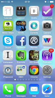
 The best bit of yesterday's WWDC 2013 keynote had to be the change of tone within the address itself. This was a side of Apple that we rarely see; aware of its criticism and the ecosystem in which it exists. I don't see Steve Jobs doing that, but I don't necessarily think that is a bad thing either.
I've had around 24 hours to review and play with iOS 7, although my initial reaction was akin to a religious experience, the lustre quickly wore off when testing on a phone filled with third party apps. Much like the Microsoft Surface ads, the iOS 7 video had lots of shots of Apple's own apps (and Jony Ive in a white room), but back in the real world, what were once beautifully designed third party apps, now look heavy and out of place; an artifical barrier now wedged between the old and new design paradigms.
I love the new design language, unlike The Verge I don't mind the icons and I can accept that this is a beta, but I have to wonder how this will affect app development.These days the best Android apps use the "holo" design language, the same with Modern UI on Windows 8. iOS, on the other had, has a history of strong third party UIs, so it will be interesting to see how developers take to, or even adapt the new interface.
Parting thought: OS X Mavericks - Calendar and Maps seem to conform to the new design guidelines, should we expect a complete overhaul by the time it is released?
Jony Ive in a white room
Andrew Gribben
@grib